
12 Website Design Trends That Will Grow Your Business in 2026
- 10 min read
- UI/UX & Web Design
- Updated 2026
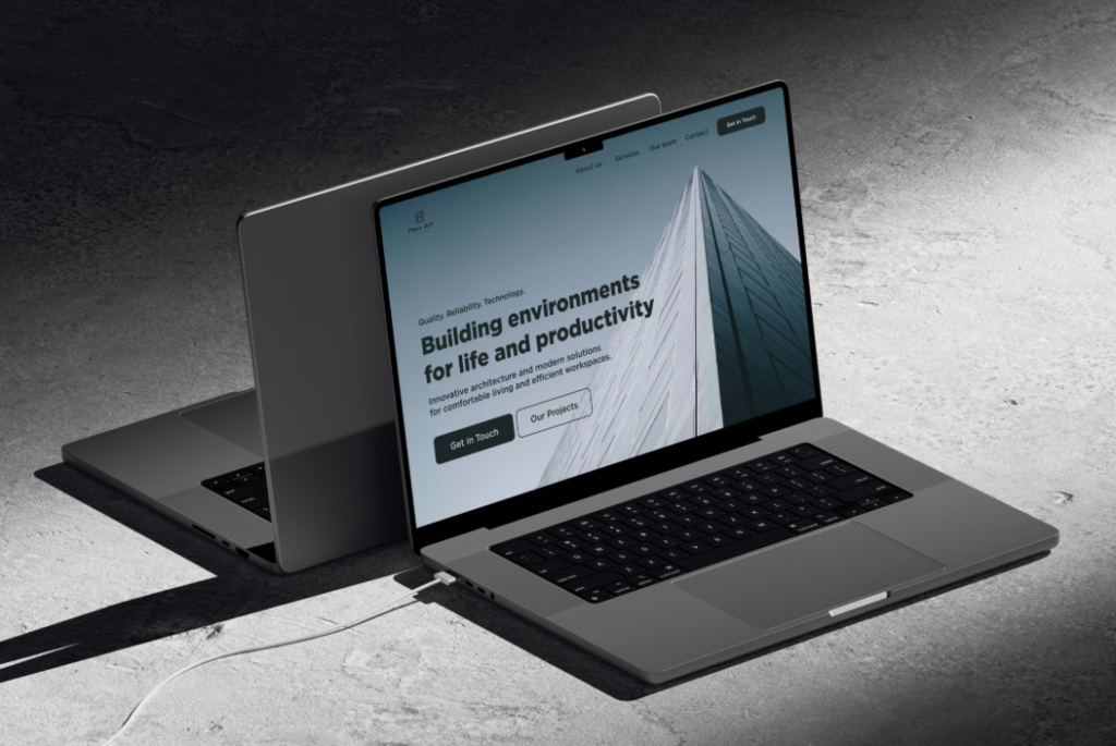
A website is often the first place customers meet your business, well before a phone call, a store visit, or a sales conversation. In the few seconds it takes a visitor to form an opinion, your layout, typography, and overall polish are already answering the question, “can I trust this business?” Modern users expect pages that load quickly, look polished on every screen, and clearly guide them toward taking action. At WebZenix Solutions, we create websites that combine visual appeal with real business results.
The latest website design trends aren’t simply about following fashion — they focus on improving trust, accessibility, user experience, and conversions. A trend is only worth adopting if it makes your site easier to use, not just newer to look at. That distinction is what separates a website that impresses for a moment from one that keeps converting visitors month after month.
Below are the twelve design approaches helping businesses stand out online in 2026, along with what each one actually changes for the person on the other side of the screen: whether they stay on the page, understand your offer, and take the next step.
Design Approaches Shaping 2026 Websites
Clean, Purpose-Driven Layouts
Mobile-First Website Experiences
AI-Powered Personalisation
AI is changing how websites communicate with visitors. Smart chat support, personalised recommendations, dynamic content, and automated lead qualification make every interaction more useful. The key is using AI where it genuinely helps customers, not as a novelty add-on.
Bold Typography & Strong Visual Hierarchy
Subtle Animations & Micro-Interactions
Accessible & Inclusive Design
Authentic Images & Brand Storytelling
Faster, Lighter Websites
Interactive Content That Builds Engagement
Conversion-Focused Design
Dark Mode & Adaptive Themes
Voice & Search-Ready Content Structure
What This Looks Like on a Real Page
Purpose-driven homepage layout
A focused hero, one clear call to action, and supporting proof below the fold.
Mobile-first, touch-friendly experience
Large tap targets, readable type, and menus that work with one thumb.
Speed & Core Web Vitals focus
Optimised images and clean code that keep scores high and visitors engaged.
Common Mistakes That Undo Good Trends
Trend-chasing without a purpose
Slow pages from heavy visuals
Inconsistent mobile experience
Too many competing calls to action
Accessibility treated as optional
No plan for updates
Trends, Applied With Strategy
We use the latest website design trends while keeping your website fast, professional, easy to manage, and focused on conversion.
Design Backed by Strategy
Every layout decision is made to support your business goals, not just visual trends for their own sake. Before we design a single section, we map out what a visitor needs to know, in what order, to move from curious to convinced.
Performance-First Builds
Clean code, optimised images, and reliable hosting keep every page fast on mobile and desktop, so the trends we add never come at the cost of load time or a smooth first impression.
SEO-Friendly Foundations
Structured content, accessible markup, descriptive headings, and fast load times are built in from the first line of code, not added as an afterthought once the design is finished.
Content That Converts
Messaging, calls to action, and trust signals are placed where visitors actually make decisions, using plain language that explains what happens next rather than vague marketing phrases.
Accessible by Default
Contrast, keyboard navigation, and clear labelling are considered in every design, not bolted on after launch, so the site works for the widest possible range of visitors.
Ongoing Support
Your website stays easy to update and current as trends and your business both keep evolving, with our team on hand whenever a section needs refreshing.
Discover
Design
Build
Launch & Grow
Frequently Asked Questions
Common questions about website design trends and working with WebZenix Solutions.
Website design trends are popular and effective approaches to layout, visuals, usability, technology, and customer experience. They help businesses create websites that feel current, useful, and trustworthy.
They help your website meet modern customer expectations. A current website can improve user experience, mobile usability, search visibility, credibility, and lead generation.
Yes. A modern website that is mobile-friendly, fast, accessible, well-structured, and easy to navigate can support better SEO performance and a stronger visitor experience.
Most businesses should review their website every year and consider a major redesign every two to three years. Updates may be needed sooner if your site is slow, not mobile-friendly, or no longer reflects your services.
Yes. Mobile-first design is essential because many customers visit websites from smartphones, and it helps create a better experience across all devices.
Yes. We can assess your current website, improve its design and performance, update the content, and create a conversion-focused experience that suits your brand.
Subtle animations can improve engagement and guide users through the page. They should be used carefully so the website stays fast, clear, and accessible.
Clear messaging, quick loading speed, mobile usability, trust signals, easy navigation, compelling calls to action, and simple contact forms all contribute to better conversions.
Absolutely. Good website design balances strong visuals with optimised images, clean development, and efficient functionality to deliver a polished experience without sacrificing speed.
Contact WebZenix Solutions to discuss your business goals, target audience, and website requirements. We’ll recommend the right strategy and create a website built for growth.
Ready for a Website Built on 2026’s Best Trends?
Whether you need a new business website, e-commerce store, landing page, or a full redesign, our team can build a digital presence that reflects your brand and supports your growth.